Today is the start of semester 2 and the start of a new brief. We have been asked to create a minimum of 2 formal typologys, that consist of at least 9 images and a composite image for each of the typology.
From hearing the brief a few ideas come to mind:
- Telephone boxes
- Nail varnish (contrast colour)
- Fingerprints casts or ink prints
- body features (eyes, hands, Tattoos)
- Electric boxes
- Portraits
I will begin my research in to typology and start to develop an ideas from there.
Typology Definition Oxforddictionaries.com
1 A classification according to general type, especially in archaeology, psychology, or the social sciences.
1.1 Study or analysis using a classification according to a general type.
2 The study and interpretation of types and symbols, originally especially in the Bible.
Typology is a visual classification, a group of images that are classified together by a “type”; this can be any common theme physical, logical or other. Typology is usually presented in a grid, to enable comparison of subjects. The term is not a photographic term and is used in many fields: Archaeology has used the term since the 1800s to classify their finds. These visual catalogues have helped establish timelines for many sites, by using a typology of the finds with geology of the site (Sequence dating) https://www.britannica.com/science/typology
One of the early uses of typology in photography was August Sanders ‘Face of the Time’ in 1929 and his ‘People of the Twentieth Century’. Sanders documented German people over decades, categorizing them by profession and class, producing over 40,000 negatives. In the project he was trying to document the hierarchy of society.


Bernd & Hiller Becher The husband and wife duo of Bernd & Hiller Becher are most synonymous with typology in photography. They started working together in the 1950 photographing ‘heavy industry’ subjects like water towers, mining tipples. They shot these subjects to document their form; the images are factual and are not meant to be pretty, each image is shot with the similar lighting, profile. By presenting them in a typology, categorized by form or type the subjects’ difference became more apparent. The Becher’s works I find interesting, the very formal approach to the works to create these images, must be hard to obtain. In my research I found that the Bechers would go back to a subject months, years after to get the correct lighting for their images. In some case the would have to wait for foggy days to ensure that they had the flat sky needed, other could only be shot in autumn once the leaves had drop of the foliage to prevent distraction or obstruction of the main focus. I do like the idea of documenting form of the same type and would like to do something on this for my work.
Video of Bernd & Hiller Becher discussing their work Pt1
Video of Bernd & Hiller Becher discussing their work Pt2
Here are some artists who have used typology as an approach.
Michael Wolf
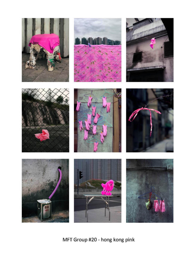 Wolf is photographer who’s subject is the everyday. In his series ‘My favorite things’ he uses a typology approach to show his favorite things. By showing the images in this way, the favorite thing becomes apparent. Wolf’s images in this series are informal and are very different in composition, in the image below you can clearly see the common theme is pink. If the images where not shown in the grid form, I believe I would reason that the focus was the pop of colour due to composition and contrast but I don’t know if individually they would be as appealing to view, using a typology I think make the images stronger. The use of colour to contrast and link the images, really works well. http://photomichaelwolf.com/#my-favourite-thing-groups-2/20
James Mollinson
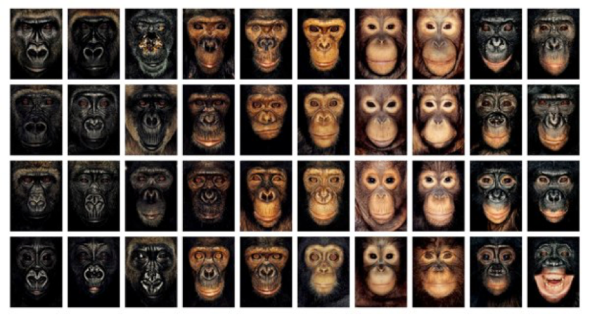
Mollinson is another photographer who uses a typology approach, in his work he use the fact that compassion is easy to do whilst presenting this way to enhance the images and creating a greater meaning. In his project ‘James and other apes’ he shoots passport style photographs of great apes and places the images in a typology, by presenting this was the unique character of the individuals comes across because you can compare easily to the surrounding images and as Mollinson uses a formal approach with the same lighting and composition, the differences are enhanced further. The passport style of the images humanize the apes, this coupled with the individuality of the faces, I feel help to get across Mollinson’s message that humans and apes are so closely linked, sharing 98% DNA and we as humans are causing suffering to the apes by destroying their habitats and that many are killed for meat trade in other countries.
Video of James Mollison talking about his typology works.
http://jamesmollison.com/books/james-other-apes/
Idris Khan
Khan has a very different approach to typology with his imagery, he approprates others work and creates new images. Instead of showing the typology grid, he layers the images over each other creating a new image that has a fainting trace of the orignal. He has applied this to many subjects the Becher photographic images of heavy industry, the pages of the Qur’an and painting of Constable.
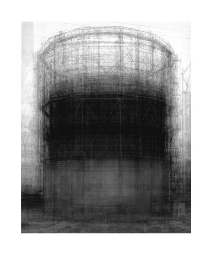 The orignal images have very little differences and due to the formal approach by the Becher are quite flat by nature, when Khan manipulates them they have more form, they appear almost drawn. I feel that the subjects look more used, the blurred lines give a feeling of movement and motion, like creating hussel bussel. I really like the images Khan produces with this technique.
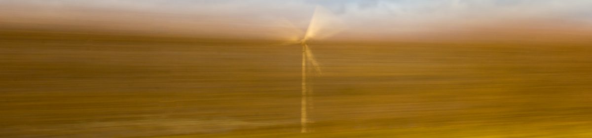
After researching Khan and his method of typology I was eager to try it out so I chose to shoot a telephone mass as practice, below are the images I created.
Idis Khan recreation


I am very happy with the images and the effect I have create. In each I have used a different amount of layers to create the effects (click on each image to see the number used) I feel the image I used 36 layers in, give a similar effect of movement and is closer to Khan style, but due to using less layers in the others I like them as they feel less chaotic. I have played around with colour and symmetry in the bottom two images to see what effect it gives. I feel in the coloured image, the red dominates and has diluted the cloud textures, making the image flatter and less appealing. I would maybe try this in the future with subtly colours to enhance the image. In the symmetry image I think the lines created by the symmetry works well, it adds a abstract quality to the image and helps lead your eye around the image.
I have created a Pinterest board of ideas for my typology work below.
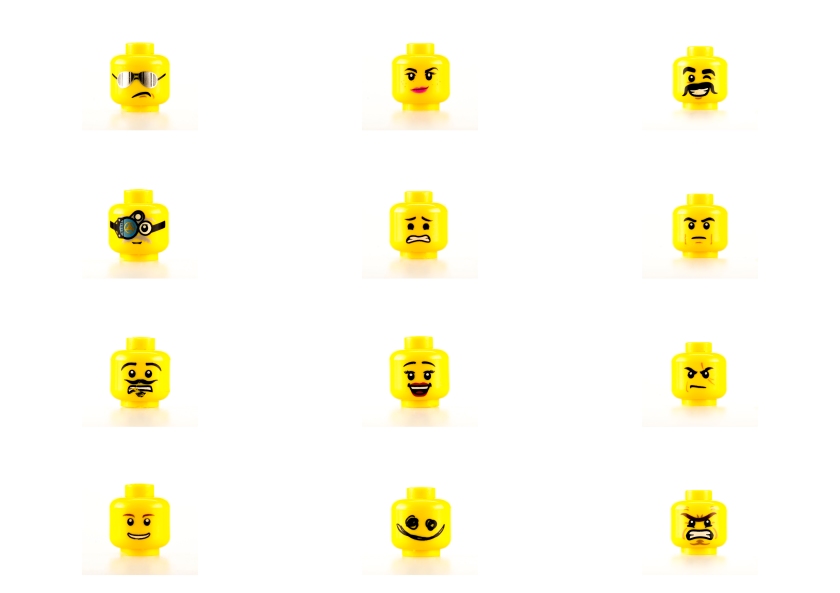
This is a typology of mini figures, shot in the studio. I chose to shoot mini figures, as a alternative to shooting people portraits, but yet still show the individuality.
In my first shoot I found it difficult to get in close to the figures, so for my second shoot in the studio I used a macro lens to enabling me to get in closer to each figure.
 I used a 3 point lighting set up of soft boxes to give even light coverage to each figure and to create a formal typology I shot each figure in the same spot, with the same pose.


In post production I adjusted the white balance as the images has a slight blue cast from the flash and moved the black and white points to increase contrast and to prevent the images appearing flat. I am happy with how the image turned out and variety of figures I managed to include.
This is the layered version of the Mini figures. To create the image I stacked the individual images from about in Photoshop and played with the opacity, this allowed me to control what was visible. The effect has work creating one figure, this is was I want to happen, its meant to show that as individual as we are, we are all in essence the same. I think the sentiment comes across but I feel the image is little brown from the layering process, using 12 figures has made the lines appear messy. I am going to look at shooting something that has the same form next time to see if that creates a less messy image.
Clipper formal typology
This I typology I created as I have a collection of Clipper lighter and to see if shooting a constant similar object will create an appealing typology.


As I wanted to create a formal typology again I shot these in the studio in the same way as the mini figures, with a 3 point lighting as it worked really well for me in that shoot. To create the typology I shot around 15 lighter from my collection, I tried to choose ones with interesting patterns on as I knew when layering happened this is the part that I want to see contrast. I did the same post product regarding white balance and black and white points.
My clipper layered typology I really like, it worked as I thought it would with the form been the same and the contrast in the printed pattern. I find it more appealing than my mini figure layered image due to the cleanness of the lines in this image. The contrast in the colours and shapes in the patterns of the lighters draws your attention there.
As part of our brief is to create formal and informal typologies I have decided to shoot outside of the studio. In the studio having total control of every aspect I find it easier to shoot I having been looking for interest outside of the studio to create my informal typology.
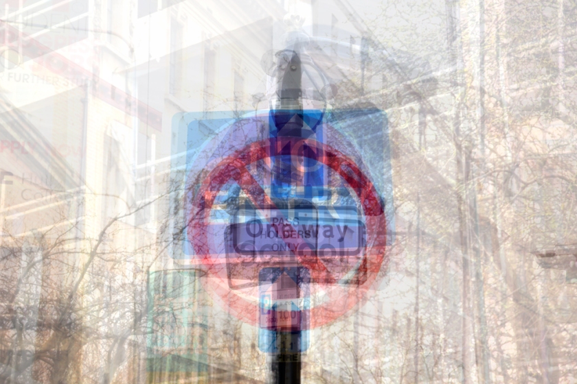
Traffic signs
I decided on traffic signs for an informal typology as there everywhere, telling us what to do what not to do and there are lots of different shapes, colours and sizes.


For this shoot I chose a flat light day to ensure the sky was not too distracting from the focal point of the sign, as my research in to the Becher has said. I tried to shoot from a similar angle and keep the sign in the centre of the image as a constant but also tried to get different backgrounds to create a more interesting image, moving away from the plain backgrounds I had created in the studio.
I prefer the layered image out of the two sign images. I feel the individual images even after post production are still flat, I put this down to the flat lighting they was shot in. The layered image work really well as a layered piece and the intentional background, as chaotic as it is appears doesn’t detract from the signs, it adds to the fact that these signs are everywhere. The contrast of the coloured signs against the background ensure this is the focal point.
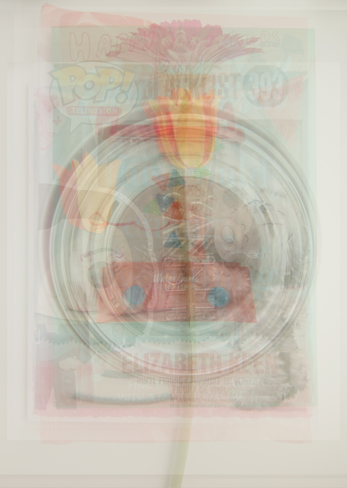
The idea for this typology was that the subjects of the images have no connection, they appear as random images, its not until you look closely at the layered images you maybe able to make the connection of Mother’s day. This layered image is made up of 9 things given to me by my sons on mothers day. As a concept the idea is good, I like the thought of some one trying to figure out the link to these items, but the images taken are underexposed making the image dark and cloudy looking, so I will not be using this image.
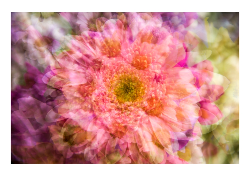
Flowers
I created this informal flower typology to see how the different forms and colours would work together. It is a informal as the lighting is not constant, as is the position of the subject. I like the range of colour in the grid typology but upon close inspection I feel the images are soft in places. For the layered images the softness doesn’t detract from the image due to the layered process. I feel the layered image work as the colour compliment each other creating a visually appealing image.
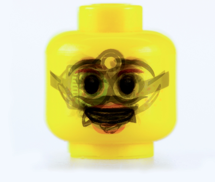
Lego head
These images are a continuation of my original mini figure idea, I found I didn’t like the messy image the layered image created, so I decided to concentrate on the head only, to create a formal uniform shape with interest in the facial expressions, similar to my clipper lighters image.
Of these two images I prefer the grid typology apposed to the layered. I think that the heads contrasting against the white background showing there individuality in expressions works. The layered images is interesting to look at because you can’t quite make out any expression, the only clearly visible part is the eyes because of this again I feel it still looks messy.
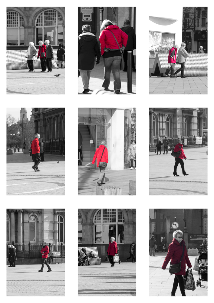
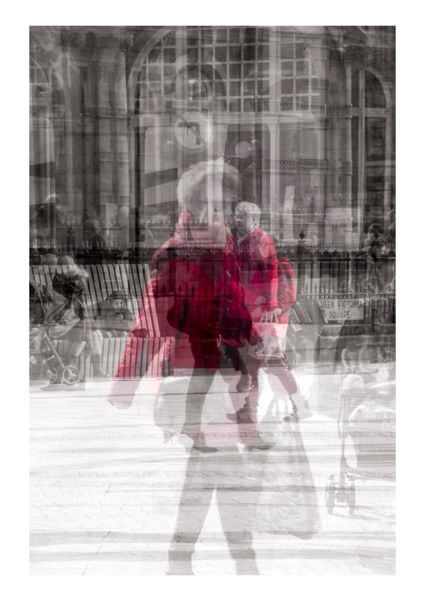
Red coat
This typology was idea I got from my research in to Michael Wolf. I took his image of pink things and decided to create on a common colour. The image have created a informal typology as the apart from the red coat there is no constant in the images.


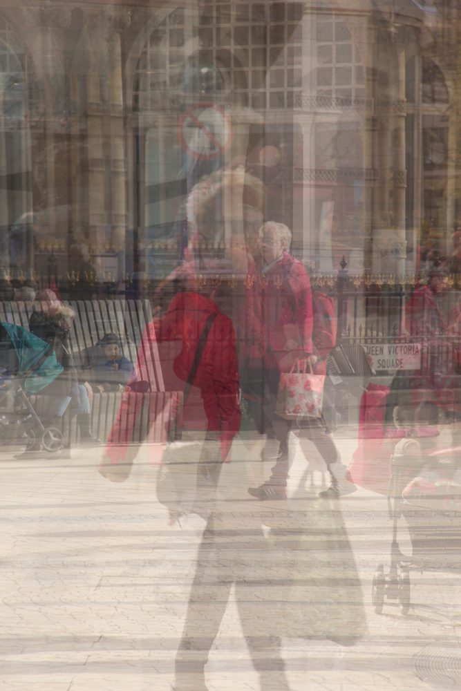
I really like the idea of the images but the colour doesn’t pop as much as I would like, so I edited the images. In photoshop I masked each redcoat and converted the rest of the image to black and white, this reduced the distraction of other tones in the images and really enhanced the images overall, by creating a stronger connection between the images in both version of it.
Evaluation
I am overall happy with the images I have produced for the brief. I feel more drawn to the layered images this is represented by the fact 6 out of my final images are this style, I like abstractness of the images created. I have used a strong theme of formal elements in my work using contrast in form and colour to increase interest in the images. I found the subject of Typology interesting and will look to develop my knowledge of area further as I progress as an artist.
My final images
Bibliography
Oxforddictionaries.com
http://www.youtube.com/watch?v=zL38jPFZIeI
http://jamesmollison.com/books/james-other-apes/
http://photomichaelwolf.com/#my-favourite-thing-groups-2/20
http://www.getty.edu/art/exhibitions/sander/
https://www.britannica.com/science/typology
